The Event & Logo Design
Posted on: 31 October 2010
It would be quite easy to lump NBC's new show 'The Event' into the fairly standard FBI 'big secret' American format of television show, à la Flash Forward. It may be a little too early to judge how this programme will play out, although similarly to Flash Forward, 3 episodes in and it has left me hungry for more.
The Event is being shown by Channel 4 and is available on 4OD. For a change, Britain is only 2 or 3 episodes behind the US.
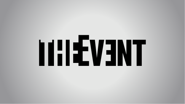
I also wanted to draw attention to the show's logo, stylised THE EVƎNT. I like it, although I may have shaved off the small amount of black on the left side, emphasising the letter 'T'.
 Image courtesy of Wikipedia
The design of logos has always been somewhat of a weak point in my arsenal and something I'd love to be good at. In the media today, logos are perhaps the most important aspect of a brand's identity, and whilst I'm confident in my website design ability, logo design remains a bit of a grey area in my skills.