How I use stats to make me a better runner
Posted on: 22 April 2024
One of the many reasons I love running is its track-ability. There’s a tongue-in-cheek saying in the fitness world, “If it’s not on Strava, it didn’t happen”. But like any hobby, you can choose how much you involve stats in it. Running can be a joyfully simple and analogue activity. Conversely, you can track any and every metric from your distance down to your running mechanics. I land in the second camp, perhaps somewhat unsurprisingly.
Returning from injury
I got injured properly for the first time at the end of last year. I say properly, I was still able to run, however it took many months to get on top of it and get back to running back at my previous levels. Throw in a bout of COVID into the mix and I began 2024 at a relatively low level of fitness.
After a couple of testing-the-water weeks at the start of the year, with volume between 45-50km, I was still experiencing repeated flare-ups of my injury. I decided to take a full week off from running to see if my hamstring pain would reduce. I've since learned that with my particular injury - hamstring tendinopathy - resting actually does little to improve recovery. Tendons like load and repair by slowly strengthening over time.
As I began a rehabilitation program with a physio, I wanted to safely track my progression back to fitness. There’s a loosely-held but widely adopted guideline in the running world: increase your running volume by no more than 10% week-on-week to minimise injury risk. I dialled my volume and intensity right back, and set about a plan to get back to full fitness. To help me with this, I reached for some tools.
Strava
Strava is a social network of sorts for active people; principally runners and cyclists. Once connected to a wearable & tracking app, it will sync everything you record and collate your stats for you. I’ve used Strava for a number of years, and have been a paid member since I started taking my running more seriously.
I find it to be a wonderful tool for connecting with other people into fitness and for keeping you honest towards the pursuit of your goals. Sharing your achievements with your peers is a surefire way to keep motivation and enjoyment high, for me at least.
There is a free version of Strava, however I find most of its prime and useful features are reserved for paying members. Some of my favourites:
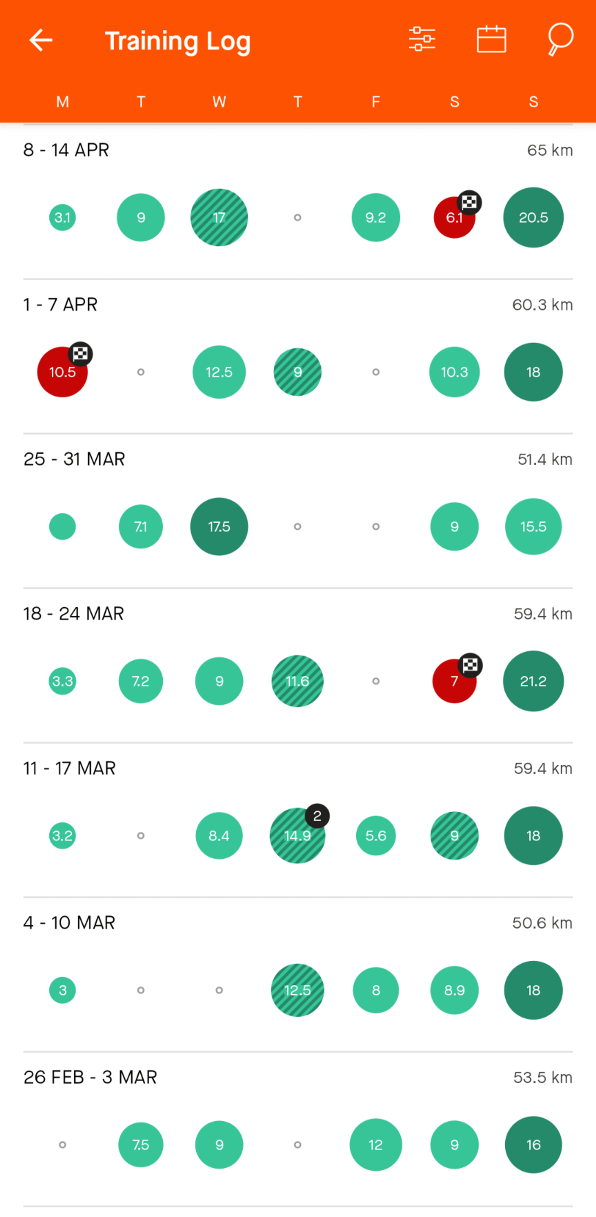
Training log
Simple, but visually very useful for checking consistency over a number of weeks. I find this much more useful on the mobile version, where multiple activities are combined giving a total of distance/elevation/time. Races, workouts and long runs are distinguished using different colours/patterns.
Comparison to similar runs
Strava will show you your activities along a similar route, and compare your performance over time. The mapping algorithm can sometimes be a bit hit and miss; but if you’re someone who regularly runs the same route, this can be a very useful feature for comparison and improvement over time.
Fitness graph
The actual number used here is somewhat arbitrary, and something only Strava knows, but the relativity can be useful to track. Consistent training with regular hard efforts and races will steadily improve your fitness score. Conversely, missing a week due to illness or injury, dramatically drops it.
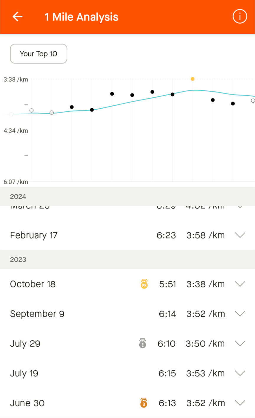
Best Efforts
Strava keeps track of your best estimated times in 400m, 1/2 mile, 1k, 1 mile, up to 50k ultra distance. It gives you an all time top 10 for each distance, plus your best 5 per year. This, combined with the graph is an excellent tool for charting your progress at a particular distance.
Mapping
I use Strava’s mapping functionality for all my long runs. It’s great for discovering new routes, checking out popular (and other not so passable) trails; and plotting out a particular distance. These routes can be synced with your watch to provide navigation during a run.
Strava also shows user-submitted photos taken along a particular route, popular times (of the day and year), and an elevation graph. Everything you need to give you the confidence to take on new ground.
myTrainingForecast
After what felt like almost starting from scratch towards the end of January, I came across a website: myTrainingForecast.run. It was their social integration with Strava that turned me onto it. MyTrainingForecast predicts your freshness and your likelihood of injury based on your activity load.
It takes an average weekly total based off your last 4 weeks (your chronic training load) and compares it to your last 7 day’s volume (your acute load). The ratio between these numbers is your ACR (Acute:Chronic ratio). This should be between 80-130% to remain in the “safe” zone and keep your injury risk low.
As an example, if you’ve run an average of 40km/week for the last 4 weeks, you can safely run between 32km (80% ACR) and 52km (130% ACR) in the next 7 days. Any less and you will begin "detraining" (losing fitness); any more and you increase your injury risk.
In all honesty, I don’t know the exact science behind this, but it sounded like a decent formula to follow, and one a little more nuanced than the age-old “no more than 10% than the previous week” advice.
The free version of MyTrainingForecast allows you to input your next 7 days of target distance and it nicely graphs your ACR values for you. It also keeps track of your risk history, which goes from x0 (not training) to x4 (4 times as likely to get injured). Staying within the green safe zone of your ACR keeps your risk profile well below 2x.
When I first started using myTrainingForecast, I kept my training right on the cusp of the safe ACR limit. I was keen to increase my volume as quickly as I could (and with it, my fitness), but mindful to not overload my tendon and experience a setback.
MyTrainingForecast’s feature set opens up with the paid plan, allowing further weeks of planning and historical visibility. It will also track things like your elevation over time.
CRPlots
Another tool I came across during my rehabilitation phase was crplot.com. A visually basic website, but one with tonnes of useful metrics to dig into. It syncs with your Strava data and will populate historically as far back as you have logged in Strava.
Its based on the Tanda Race Predictor (https://tandaracepredictor.com/) and its main purpose is to predict and track your marathon time. The formula is based on, essentially, how often you run, and at what pace. For example, someone running 50km a week at a 5:00/km average pace could expect to complete a marathon in an average time of 3:23:37.
Another very useful graph on crplot.com I made use of was Net Heart Rate Efficiency. Not least because of the stark drop I observed post-injury, and later, post-COVID. Net HR efficiency compares your heart rate against your pace (it may also take into account gradient).
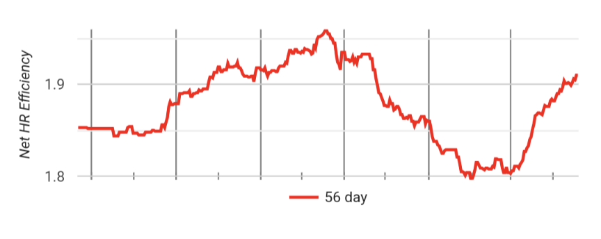
Heart rate is personal to you, so this figure shouldn’t be compared with other runners, however, it can be used as a relative indicator of your own fitness. It was clear to me how much my fitness had dropped since my apparent peak at the beginning of October. Injury, donating blood & COVID had collectively done a number on my HR efficiency. Tracking this slow improvement over time has been rewarding and confidence-boosting.
For heart rate training to be effective, a chest strap HR monitor is required. This ensures this greatest level of accuracy in the data collected. Your wrist-based monitor will get you 90% of the way there, but shouldn’t be relied upon if you’re taking the data seriously. I use the Garmin HRM Pro Plus.
CRPlot will also show you your distance & speed based on a rolling average of the previous 8 weeks. This is really useful for visualising your volume, and the paces you’re running at. Simplistically, the faster you can sustainability run, the fitter you’re getting.
The Spreadsheet
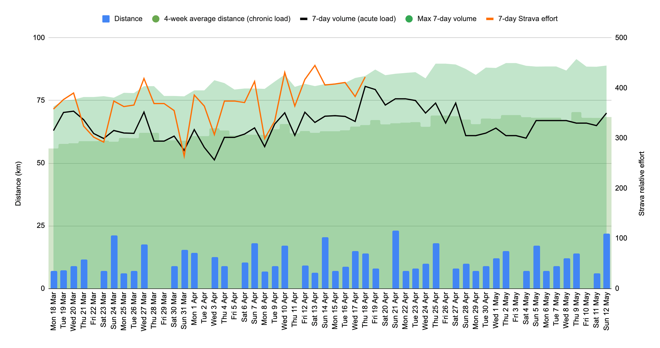
After a few weeks, the limitations of the free plan on MyTrainingForecast (MTF) left me wanting more. I weighed up whether it was worth upgrading (£44 for the year), but decided to try tinkering in Google Sheets first. I knew roughly the formulas MTF employed for calculating acute/chronic figures and the resultant ACR; and a little data entry later, I had the last 8 weeks of my training entered into a spreadsheet.
An advantage this had over MTF was I was able to not only chart the individual types of runs I’d done, but also forecast and plan my future training. I also had a single place where I could easily total weekly distance and weekly quality effort. This, along with rolling chronic & acute load figures and ACR were easy and effective to display in a graph too:
Forecasting
Something I’ve never really done in my training (outside of a structured training plan) is plan my workouts ahead of time. I went into weeks having a rough idea of target volume, and then mostly made up the workout type on the spot each time I ran. Planning weeks ahead allowed me to more effectively schedule running around my other commitments and ensure I was steadily increasing my volume and hitting my ratios.
I follow the widely accepted advice in the running world of keeping 80% of my volume at an easy, conversational pace. The remaining 20% can be faster, harder effort.
Recording both total distance of runs and total “quality effort” makes maintaining an 80/20 ratio week-to-week much easier. Planning ahead also provides a clear marker for target races. I highlight these rows in green so I can see exactly how much time and exactly what individual workouts I have planned leading up to that race.
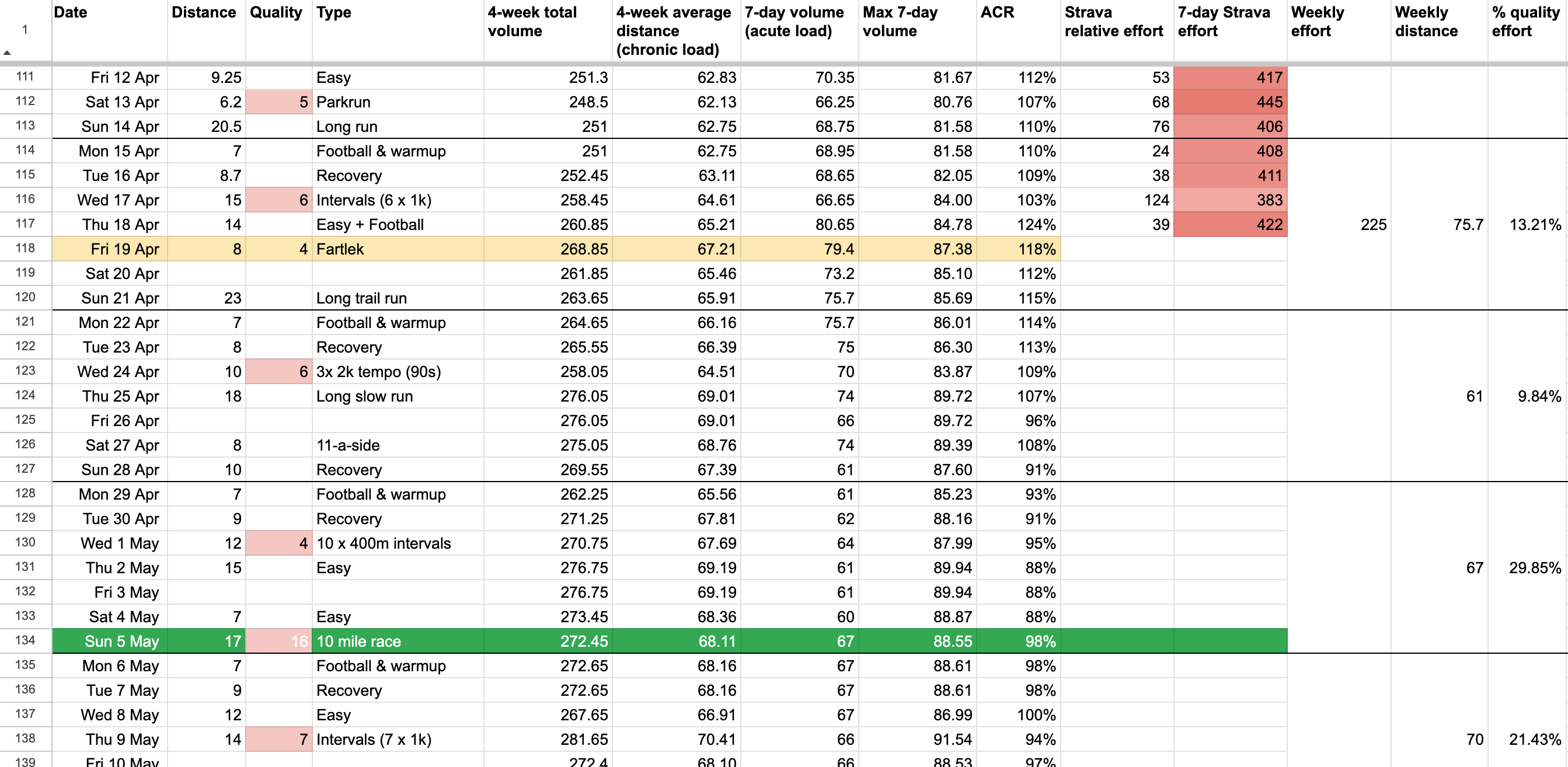
Relative Effort
After a few weeks using the spreadsheet, I decided to add in an extra data point: relative effort. This is a proprietary Strava metric based on a number of factors including heart rate and pace. Each activity is given a Relative Effort score based on perceived effort throughout the workout. Manually entering this into the spreadsheet after each run gives me another metric to track and chart over time; ensuring this stays relatively consistent and dropping for deload weeks.
A deload week is a planned block of runs at a collectively lower effort and/or volume compared to a typical week. This allows the body to recover from hard efforts and consolidate improvement gained over recent hard efforts. A deload week is typically taken every 4-6 weeks to stave off burnout.
If I’m training consistently and staying within a safe range of exertion, the Strava relative effort 7-day rolling average should remain stable (with a slight drop during a deload week). The theory being, as your fitness increases, the effort required to do the same workout drops. You’re therefore able to put in more effort (by increasing distance, pace or elevation) but maintain the same relative effort.
Training blocks & maintenance
A training block describes a set length of time in which to reach peak condition for a “goal race”. Training blocks can vary in time, but a typical marathon block is between 10-16 weeks. During this time your volume should trend upwards as you train to gain fitness, with a taper at the end to put some freshness back in your legs before the race.
Ready-made training plans can be acquired on the internet at relatively low cost. More advanced runners may devise their own or seek a more specific plan from a coach.
Forecasting my training in a structured way, allows me to make my own training plan, taking in inspiration and advice from numerous sources. I can ensure a consistent but safe upwards trajectory in volume and easily track the effectiveness and intensity of the workouts by monitoring relative effort.
Maintenance is what happens in between training blocks. Your body needs rest after preparing for and executing a goal race. During this time you’ll likely reduce your weekly distance, potentially substantially. You may look to cross-train to let you recover mentally and physically.
MyTrainingForecast suggests fitness can be maintained with an ACR (Acute/Chronic ratio) of 80%. This means if you’ve averaged 50km/week for the last 4 weeks, you can reduce your weekly volume down to 40km and not lose any, or much, fitness. And the next week, 38km.
Forecasting my runs and tracking my rolling ACR by the day means I can easily dial in a maintenance schedule post-race and be confident my fitness will be maintained.
Final thoughts
There are a million ways to over-engineer the simple activity of running. But there are an equal number of ways to use stats to enhance your running performance and keep you healthy. Ultimately, runners will sit across the entire spectrum.
I’ve built up a set of tools and practices that aim to keep me injury free, plan efficiently and safely for goal races, and keep me excited for my next run. I wouldn’t have it any other way. Heaven forbid my watch runs out of battery mid-run!
I love talking about running, so if you’d like any advice or just want to chat shop, hop onto my Strava!